SaaS website examples, and what each does well.

Nine SaaS homepages and landing pages, annotated: what the hero says, how the product is shown and where the proof sits. Plus three real SaaS sites worth studying.

The nine annotated examples are sample brands designed by dgitl.

The patterns

Five things the best SaaS homepages share.

  1. 01The headline names the outcomeA buyer should know what changes for them before they know what the product is called.
  2. 02The product is the hero imageA real product view, doing one job, beats an illustration or an abstract gradient.
  3. 03Proof sits near the topLogos, a named quote or one hard number, within the first scroll.
  4. 04One primary call to actionTrial or demo, sometimes both, but one is visually louder. Everything else is secondary.
  5. 05Sections answer objections in orderHow it works, does it fit my stack, is it secure, what does it cost. In the order a buyer worries about them.
The examples

Nine homepages, annotated.

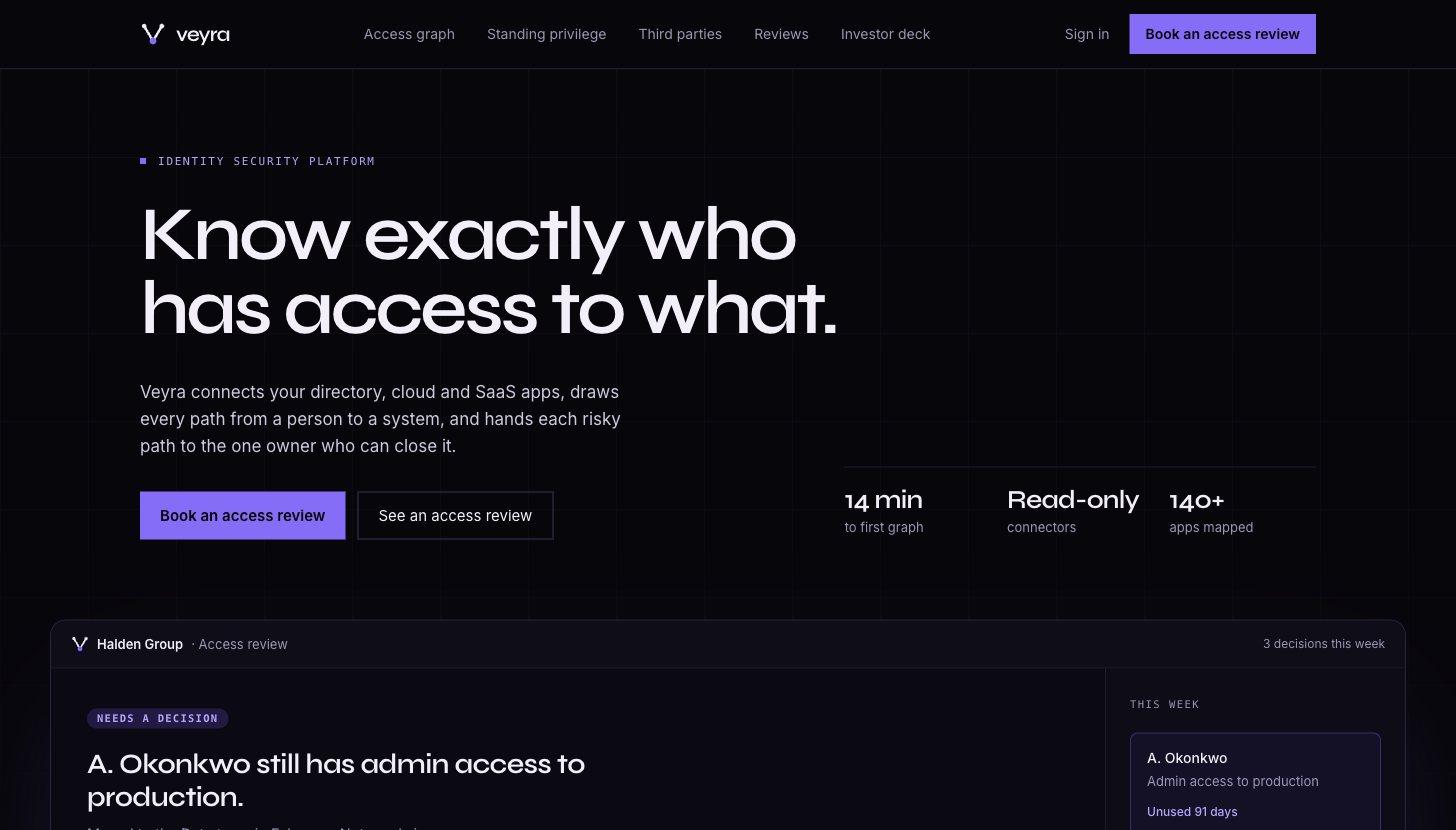
Veyra sample SaaS homepage hero

Veyra

Identity security

An access graph turned into one decision at a time, so a security buyer sees the product working in the hero.

  • One risky access path drawn as the hero
  • Vendors, bots and people on one table
  • Twelve-slide seed deck on the same story
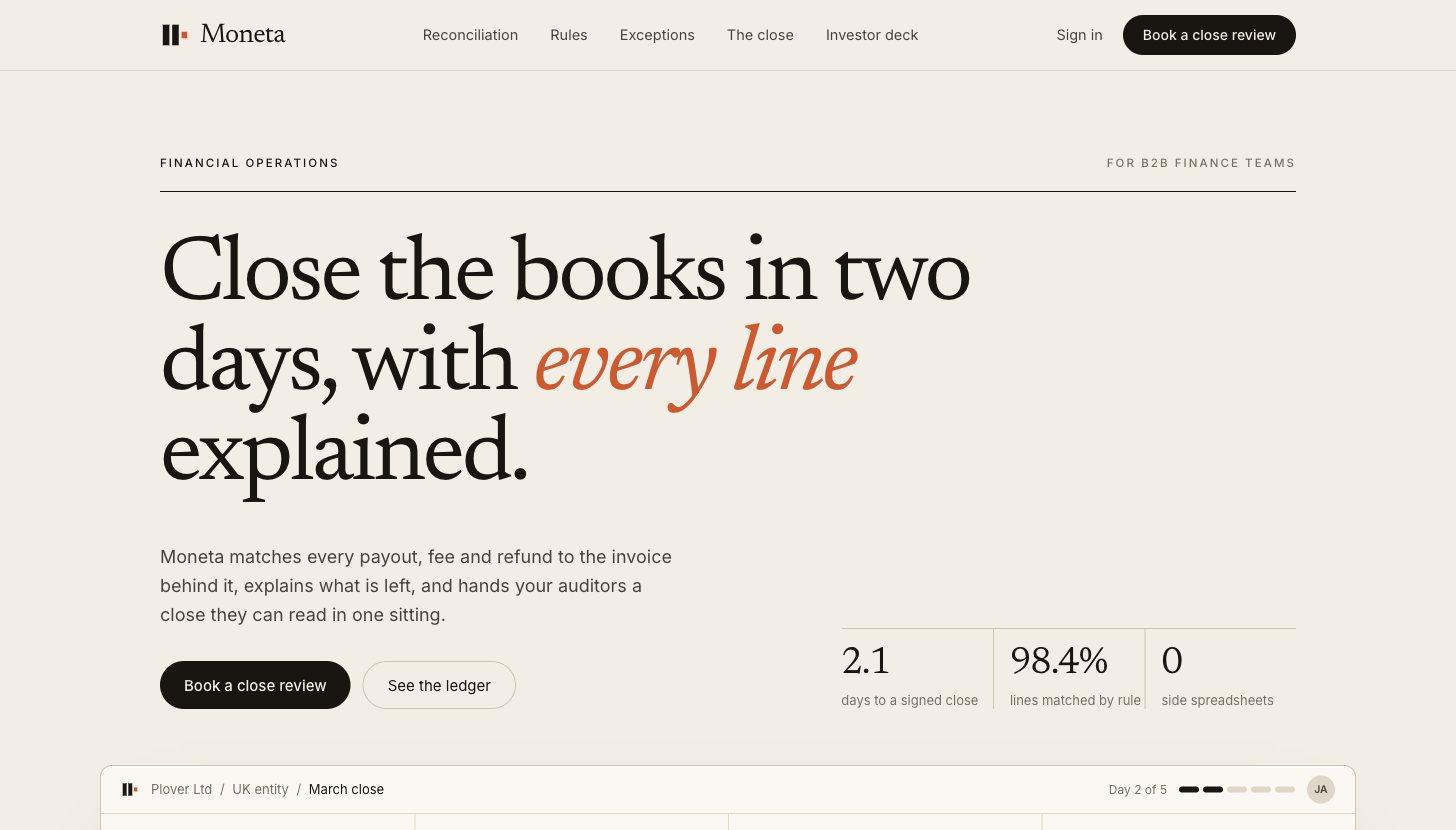
Moneta sample SaaS homepage hero

Moneta

Financial operations

A calm, editorial brand that shows a controller every match and the reason behind it.

  • Live reconciliation ledger in the hero
  • Proof told as a before-and-after close
  • Deck with an invoice-style pricing slide
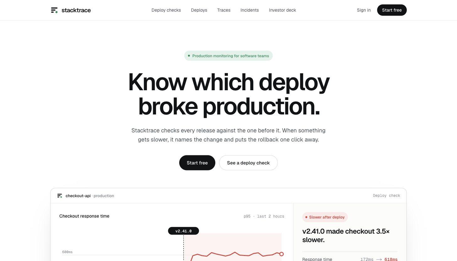
Stacktrace sample SaaS homepage hero

Stacktrace

Production monitoring

A clean, developer-first page that answers one question: which deploy broke production.

  • A deploy verdict as the first screen
  • Incident time broken into its parts
  • Deck that opens on a live deploy log
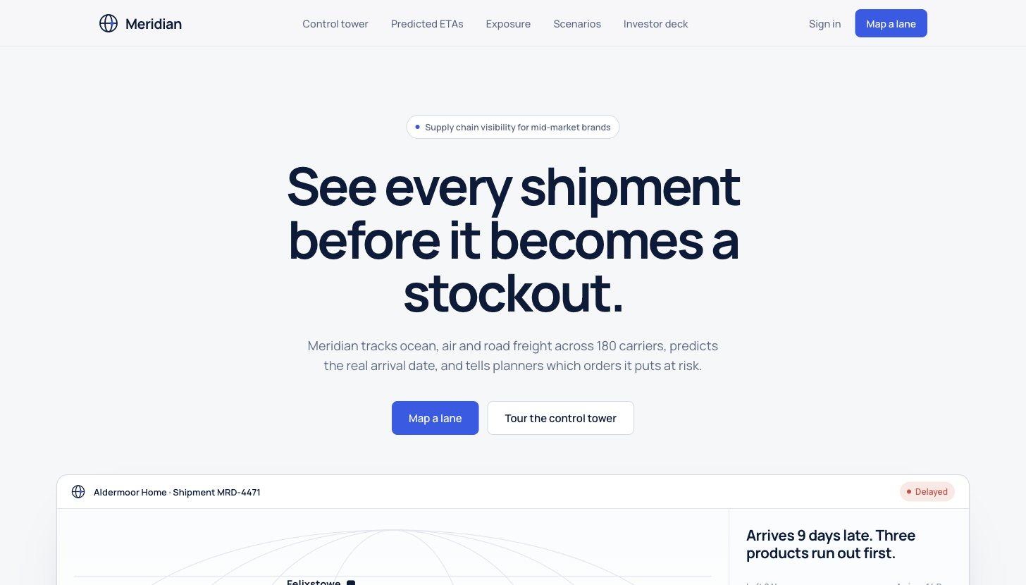
Meridian sample SaaS homepage hero

Meridian

Supply chain visibility

A late container shown as the orders it breaks, with the fix priced on the same screen.

  • Route map with the planned and actual paths
  • Stockouts listed by date, fix priced inline
  • Series A deck built around one shipment
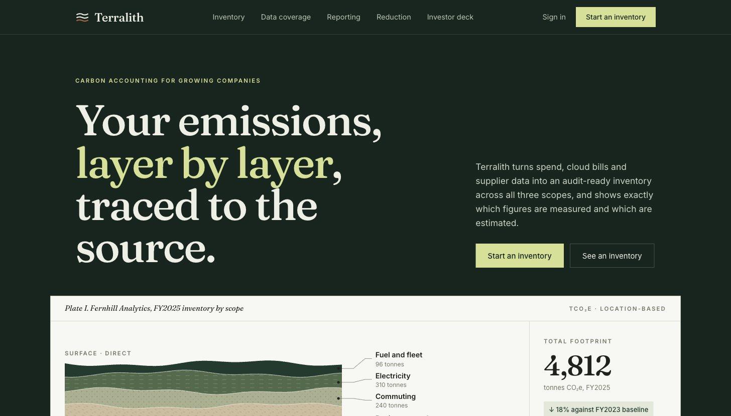
Terralith sample SaaS homepage hero

Terralith

Carbon accounting

A footprint drawn as geological layers, so every figure reads as measured or estimated at a glance.

  • Strata chart as the brand device
  • Every framework on one reporting band
  • Core-sample proof of better data
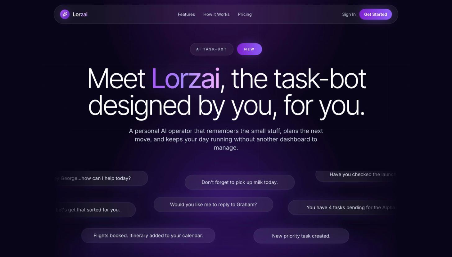
Lorzai sample SaaS homepage hero

Lorzai

AI task-bot

A personal AI operator, sold by showing the product talking instead of listing features.

  • Live assistant bubbles carry the hero
  • Features cut to four calm promises
  • Ten-slide deck on the same story
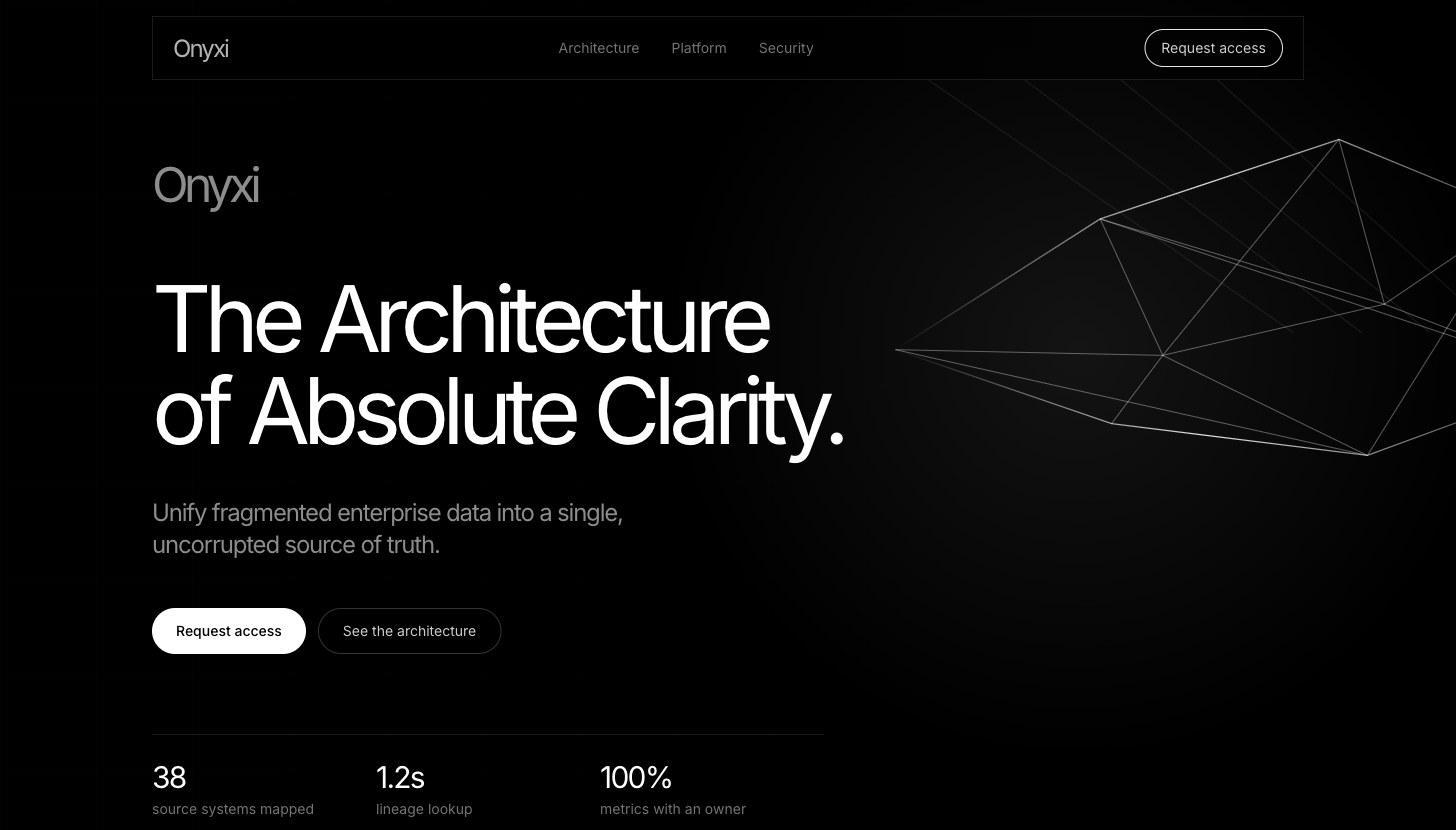
Onyxi sample SaaS homepage hero

Onyxi

Enterprise data platform

A monochrome, architectural system that makes a data trust layer feel precise to executive buyers.

  • Wireframe geometry as the brand device
  • Data pipeline drawn so executives can follow it
  • Features written for the CFO who signs off
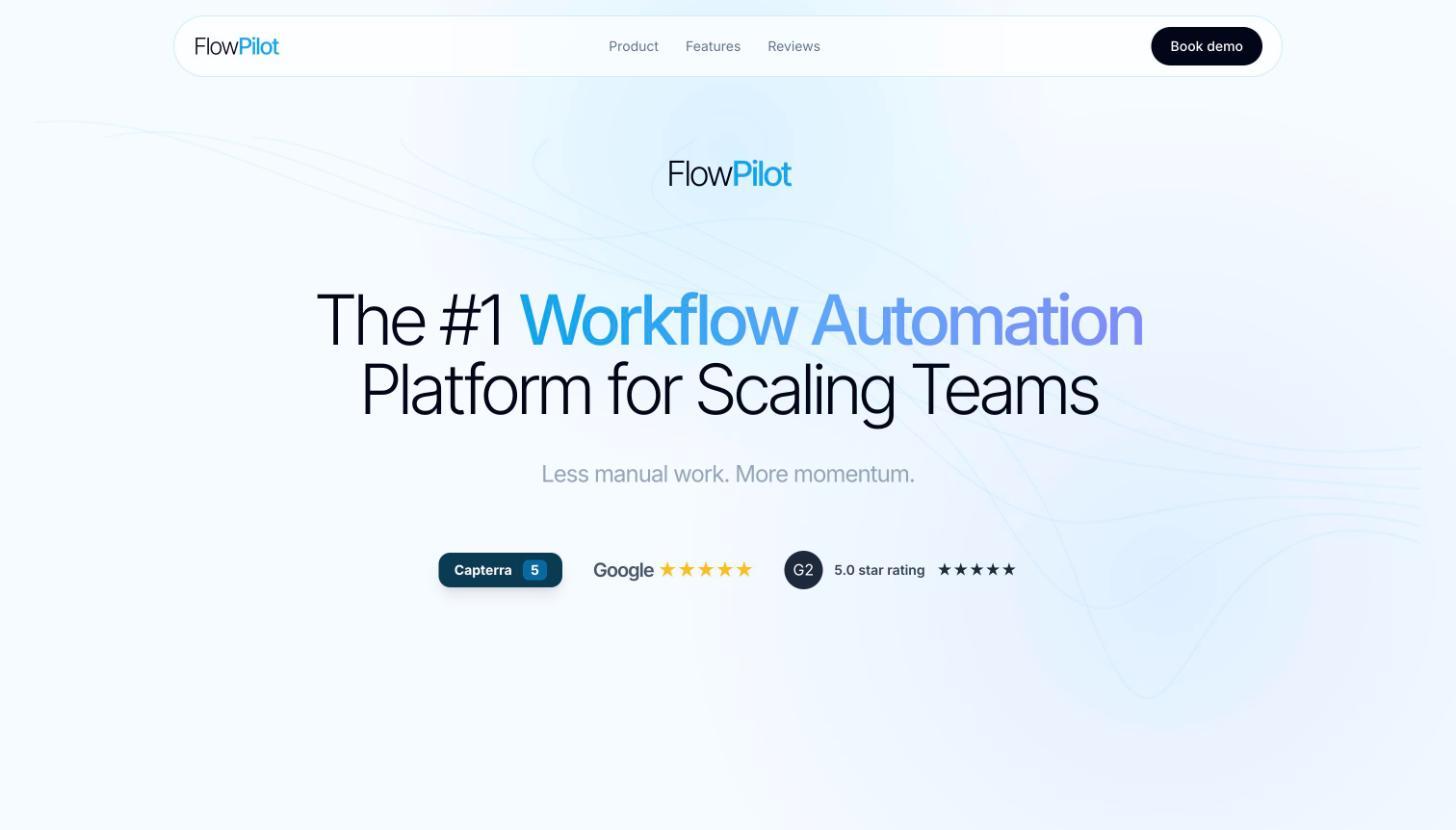
FlowPilot sample SaaS homepage hero

FlowPilot

Workflow automation

Light and review-led, with an interactive builder that shows the product working in the first scroll.

  • Review scores right under the headline
  • Interactive workflow builder in the hero
  • Deck mirrors the page: pain, demo, proof
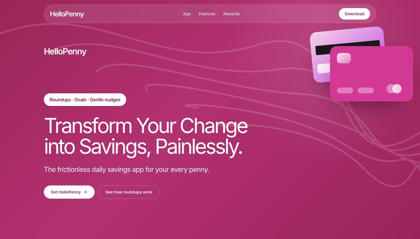
HelloPenny sample SaaS homepage hero

HelloPenny

Savings app

A bold magenta launch that makes saving feel encouraging and kind.

  • Card-led hero that stands apart from blue banks
  • Product UI with real-feeling numbers
  • Launch deck built around the habit loop
Real sites

Three SaaS websites worth studying.

As we saw them in November 2026. Homepages change often, so check the live sites.

  • Linear

    Leads with its category in one line, “The product development system for teams and agents”, and uses the real app as the hero image.

  • Framer

    Picks its audience in the headline, “the pro website builder”, then shows a working editor with an agent mid-task.

  • Clay

    Stands out with a hand-built illustrated world in a category of dashboards, under an outcome headline: “Build systems to grow revenue”.

FAQ

SaaS website questions.

What makes a good SaaS homepage?

A headline that names the outcome, the product shown doing one real job, proof within the first scroll, one primary call to action, and sections that answer buyer objections in the order they come up.

What's the difference between a SaaS website and a landing page?

A website covers the whole story across several pages: homepage, product, pricing and supporting pages. A landing page is a single page built for one audience or campaign, with one action. Most SaaS companies need both.

Are these real companies?

The nine examples with screenshots are sample brands designed by dgitl to show the work. Linear, Framer and Clay are real companies; our notes describe their homepages as we saw them in November 2026, and they may have changed since.

How do I check my own homepage?

Run it through a five-second test: show it to someone for five seconds, then ask what the company does and what they'd click. Our free 5-second test tool estimates what a skimming visitor notices first.
Want your homepage to work like these?

Send your current site and what you need it to do. You'll get a scope, timeline and fixed quote within 48 hours.